Blog Archive

Wednesday 27 April 2011

Friday 1 April 2011

Evaluation Task 1

1. In what ways does your media product use, develop or challenge forms and conventions of real media products?


Frame 1 -
I chose the Lionsgate logo to appear first in this sequence because it is the first thing that my audience sees. Lionsgate also produce many horror films; I know this from personal experience and I saw that the logo was a regular occurrence in many horror trailers. Therefore when the Lionsgate logo appears first, many members of my audience will know that they are about to view a trailer for a horror movie. I also chose the logo to come first as it looks professional and it is very conventional. It was very easy to include this logo in my trailer, I copied and pasted it of Google images and then dragged it into the editing space on Corel Video Studio 12.

Frame 2 -
This is the third film clip in my trailer but I wanted to put it second as this is a very explosive part of my trailer. The character, 'Tom' shouts: 'Stay away from me!' and points at the camera. While doing test viewings, this made some members of my audience jump which is exactly the reaction I wanted. This also identifies Tom as the main antagonist to the audience. I had some trouble filming this clip; I had to do numerous times as my brother kept laughing, or he wasn't shouting loud enough.

Frame 3 -
I chose this frame to come third because it is very aggressive, but Tom isn't actually saying anything. I chose to film this as a head and shoulders/close up so the audience could see the 'blood' and Tom's aggressive expression. This frame shows the audience that there is gore in this film, and this is the only shot that I have to convey that. I had to use stage blood for this shot, so I had to carry out allergy tests to ensure my brother was not allergic. Putting the blood on was not difficult, I used a clean make up brush and tried to spatter the blood around his mouth as if he had bitten into someone.
This shot may also leave the audience wondering who's blood it is; is it Jade's or are there more victims in this film? I made sure that my audience would be as mystified as possible so that they would take an interest in the film.

Frame 4 -
I used a knee high camera shot in this frame as the main focus if the knife. I like this shot because it's as if Jade is hiding and she can only see Tom's legs and the knife; therefore this could be considered a point of view shot too. It is clear that this shot is in a house and Tom is saying: 'Come out, Come out, wherever you are', this adds to the terror because it's as if Jade has no escape from her crazed brother who is dragging a kitchen knife along the wall. This shot also tells the audience that there is going to be violence in this film too; this is why I put it right after the 'bloody mouth' shot.

Frame 5 -
I decided that I was going to bring Jade into this sequence as a victim. Therefore I have chosen the shot where she is hiding in the house and Tom is likely to be outside as she is looking out the window away from the camera. I wanted to have darkness in this shot as the previous shots had been relatively normal in terms of lighting. The lighter symbolizes hope but there is so much darkness at the same time. At the end of this shot the lighter goes out and there is a blackout at almost the same time. This may come across to the audience that something is going to happen to Jade; implied violence.
In a more realistic sense, the audience could ask...Why isn't there any power in the house? In many horror films the power often goes out if events take place in a building which usually adds to the suspense as something could jump out at the characters at any second.

Frame 6 -
This frame is the main title of my film. The font I used was Footlight MT Light; which is the font I used for the other captions in the trailer. I kept this font for my title so it was consistent with the other captions and because it is very similar to the font I used on my poster. This font is very simple but striking, especially against the red background, and I didn't think the font needed any added effects. I decided to use red for my background to depict bloodshed, especially as the shot before this title is of Tom dragging Jade away into the darkness. The red also grabs the audiences attention; it is very recognizable and memorable and these two things are key in teaser trailer production.

Frame 7 -
This frame shows Tom when he begins his descent into madness. This is a downwards shot and shows Tom simple looking up with a stony expression on his face. Jade says in this shot: 'You don't look so good' so this is an unusual response for anyone if this is stated to them. This is the second film clip in my trailer and it comes right after the caption 'People Change.' Therefore this gives the audience leading questions about Tom. This shot is not aggressive at all; just a little sinister, which is exactly what I wanted because it does not prepare the audience for the next shot where Tom shouts: 'Stay away from me!' which is a huge step up in his behaviour.

Frame 8 -
This frame tells the audience when the film is coming out, which is important for the audience to know because if they are interested in the film they can look up on the internet what films are coming out in the Fall and perhaps get some more information about my film.

Frame 9 -
This is the last piece of film in my trailer. It is of Tom dragging Jade off from the light into the darkness. This lighting was done entirely on purpose as the darkness symbolises uncertainty and danger as Tom has just emerged from there and the light represents safety. Jade can still be seen being dragged off as the fade out becomes darker; this is meant to leave the audience on a 'cliff-hanger', this means that they are unsure of the outcome and hopefully this will encourage them to go and see the film to find out what happens.

General Point -
Costume was not a major issue for this trailer, but I ensured that all characters wore plain clothes; either black, white or grey. This is because bright colours or patterns may distract the audience from the trailer itself. Some of my test audience asked me why Tom was not wearing all black and I said it was because it would be a bit of a cliché if I were to do this, so I allowed my brother to wear white tracksuit bottoms.

Friday 18 March 2011

Evaluation Task 2

How effective is the combination of your main product and ancillary texts?


All of the shots from my trailer, pictures of my poster and magazine link together; you can tell that they are all from the same film.

The title from my trailer is very recognizable and has a similar font to my poster. Also the element of blood and red link the two together. My poster also links with the frame from my trailer of Tom with blood round his mouth; both images have the element of violence and bloodshed in them.
My magazine image is of Tom raising a meat clever above his head; this links with the frame from my trailer where Tom is dragging the knife along the wall as both images are threatening and aggressive and have weapons in them. These images are consistent in identifying Tom as the main antagonist of the film, they also put him in a position of power, something I have constantly tried to get across the audience.
Tom has the same aggressive expression on his face on my magazine cover and on the 'bloody mouth' shot from my trailer, both shots are serious and his eyes stare directly into the camera in each photo.
The last film clip where Tom is dragging Jade away links with the three other images of himself (Magazine cover and the 2 film shots). This is because all of the photos show Tom as aggressive and in power; 2 of the images give him control because of the weapons, the other image shows him as aggressive and he has clearly wounded someone because of the blood round his mouth so this emphasises his power over others and the image of Tom dragging Jade away is self explanatory; all he needs is his strength to have her under his control.
My main product and ancillary texts are an effective combination; nothing looks out of place and all the images link together because I have thought carefully about each task I have been set and I made sure that the image of my film was consistent in each one.

Tuesday 15 March 2011

Evaluation Task 3

What have you learned from your audience feedback?

I have interviewed two people from my test screening that I did a few weeks ago. They were both girls, the first girl is 18 and she is currently in college. The second girl is 19 and she is on a gap year before she goes to university this September. Both girls are within my target audience. These were the only two people from my test audience who were prepared to be interviewed and neither of them wanted to be filmed or have their pictures on the internet so I had to do a recording instead.

Girl 1


Girl 2


I am pleased with the feedback from my audience, their comments have shown that all my products are easily recognizable and they work well together because of the links they have identified. By a promotional package being identifiable, it creates a brand image for the film and this aids in promoting it, which will hopefully encourage other people from my target market to go and see the film when it is released. Branding also sets my film apart from others; these are the techniques used in the professional film industry to promote films. I really enjoyed making the trailer, magazine and poster and I am so pleased at the positive feedback I have received.

Saturday 12 March 2011

Evaluation Task 4

What have you learnt about technologies from the process of constructing this product?


Above are all the different technologies I used to make my teaser trailer. I will now explain how I used these technologies and learnt new skills from them:

1. I used Corel Video Studio Pro to edit my teaser trailer. I have never done any video editing before so this was completely new to me. I learnt how to trim down clips so that they flow together as a video, distort the visual video, add special effects like black outs and fade outs, add soundtrack with a video and how to fade out soundtrack. I used this software because digital information such as music, film and pictures can be uploaded onto the software with ease to create a trailer or short film. If I did not have the use of a video editing program like Corel Video studio, I would have to edit my film using the analogue technique; which is literally cutting a roll of film to take out the parts you do not want. This would be extremely time consuming and tedious and I would not be able to make quick changes and add in extra material like I have done with this software.

2. I used my laptop for gathering my research and processing my blog. I also used a school desktop computer to edit my trailer as I do not have Corel installed on my laptop. I did not really learn anything new in terms of my laptop because I have had one for such a long time. However, my laptop was essential for the completion of my project; my laptop is able to store huge amounts of information and digital technology such as film, music, audio recordings and word documents. My laptop also gave me access to the internet, so I was able to edit my blog whenever I liked; if I did not have easy access to the internet via my laptop then I would have had to wait for my next media lesson in order to add things to my blog. My laptop also backed up all the digital and written information for this project; if something was to go wrong with the school computers and I lost my work, I would not have to start all over again because the information would be saved on my laptop. I also used my laptop to transfer information to the school computer; video clips that I had filmed over the weekend were transferred from my laptop via a USB cable so that I could resume editing them on Corel Video Studio.

3. The tripod was also a new piece of equipment to me. I had not done any serious filming before so I had never used one. However, I learned how to do different types of shots with the aid of the tripod; it also kept the camera steady while I was filming.

4. I used Google mainly for my research at the beginning of this project. Google gave me access to lots of information within a few seconds; if I did not have this access then I would have to go to a library to get the books I needed which could take hours and would slow my project down a great deal.

5. I used my own camera to take pictures for my magazine and my poster. My camera is a Nikon D3100; it is very easy to use and allows you to take high quality pictures. In the past I mainly used this camera for pleasure; taking pictures of my friends and family. However, I have learnt that taking good pictures fit for a magazine/poster is not as easy as it looks. While doing my magazine and poster I had to change the lighting numerous times to get the perfect picture. I now know that professional photos are taken with many artificial lights which can be brightened or dimmed to compliment the picture.

6. USB cables were essential in transferring all my work from the school computer to my laptop. USB cables are quick and easy to use and were essential in the success of my project. USB cables are able to transfer most forms of digital technology which was ideal for my project as I had various types of data to transfer such as sound, music and video.

7.I used PhotoShop to create and edit my magazine and my poster. I had used this program a little last year for my music and school magazine, but I did not do anything extraordinary. This year I learnt how to edit out unwanted logos, add effects to fonts, change the lighting of a picture and how to insert other images such as bar codes and 18 logos over other images. Without the use of PhotoShop I would have to edit my poster and magazine manually; by sketching in modifications and scanning the image.

8. I used my own video camera to film my project; it is a Panasonic HDC-TM700 HD Camcorder. This video camera shoots very high quality film and the quality of the image does not depreciate when the camera is zoomed. I bought this camera for the purposes of this project as it was very highly recommended for shooting amateur films. This camera has a memory card which allows me to transfer my data from different computers; I found this very useful while transferring videos from my laptop to my school computer.

9. I used YouTube to search for possible soundtracks for my trailer. YouTube is a fast site that has a huge amount of music and videos to choose from. I found what I was looking for on YouTube (28 Days Later soundtrack) but I ended up making an account and putting all possible tracks into a playlist so that they would be saved and I wouldn't have to search for them all over again. If I did not have access to YouTube then I would have either had to listen to samples on iTunes or actually go and buy the soundtrack itself from a store. This would be time consuming and the soundtrack may not even be suitable so I would have wasted money too. As there are so many different music tracks and videos on YouTube I had a very good choice; if I did not have access to YouTube I could have missed out on some really good songs for my trailer.

10. I already had an account with iTunes so this program was not new to me. I used iTunes to buy the soundtrack for my trailer. The cost of the soundtrack was £1.50; it is very important that I did not download any music illegally. The song I downloaded from iTunes was insterted into Corel Video Studio very easily. iTunes is a fast program that works with both Macintosh and Microsoft computers. The songs from iTunes can be played on many programs such as Quicktime, Windows Media Player, Corel Video Studio and many more. Therfore it is very accessible to many people who do do not have a Mac computer or the iTunes software.

11. I used Blogger last year for my AS media project. Therefore I know how to use this program quite well. However, last year I did not upload any videos or links so this was something new that I found I could do on Blogger. I have used Blogger to document my whole project; it is very useful as it is easy to use and displays everything in order. Using blogger has allowed me to include digital technology such as sound, music and video; I could not have done all of these things if I had done a simple essay write-up.

Thursday 24 February 2011

Audience Feedback From My Trailer


Here is my completed trailer. I now had to get some audience feedback from my target age group to see what they thought. I did a viewing of my trailer with 12 people, 7 boys and 6 girls aged 18 - 20. I gave 3 viewings of my trailer and then asked everyone to complete some questionnaire sheets that I had prepared. They were to rate 8 different categories that I had chosen out of 10; 10 being the best and 1 being the worst. Obviously I could not do a graph for each person so I got the mean average from each category and put them into a graph:


I am quite pleased with the feedback I got, I am sure that most of it is reliable because I made the questionnaire sheets anonymous and I did not know all the people who viewed my trailer so they would not be biased to give me higher scores than I deserved; this is why I did not let any of my close friends take part in this viewing.
The lowest average marks I got were for Costumes, Realistic and Scary. I gave my audience a few lines to write why they gave certain scores to certain categories. For Costumes, most people said that they gave a lower score because costumes were not really an issue in this trailer, others said it would have been good and more realistic to tear some of Tom's clothes and add blood spatters. This point ties in with the next category that got lower scores; Realistic. Many people in my target audience said that it was because of my amateur equipment and resources that it was less realistic, but if it had been a real film then they would definitely go and see it. Others said it was less realistic because they knew the two actors in the trailer and they knew it was my house where I was filming. Other than those three categories I am pleased with my audience feedback; it is always important to take on constructive criticism even if you are fixed on an idea and are convinced it is going to look good.

Saturday 19 February 2011

Analysis of Filming - Part 3

This weekend I shot the last part of my trailer. I had also decided to change the ending of my trailer as I felt that the original clip was too long and it didn't look very realistic:


I wanted to include both Jade and Tom at the end of the trailer as they are both at the beginning too. Also I thought that if I blacked out the film as the lighter went out and included a scream, it would seem comical even though it is implied violence. Therefore I came up with another idea; Jade would walk into a well lit room and Tom would then drag her away into a dark room behind him. I feel that this is implied violence that does not look too comical. Unfortunately after I edited this video into my trailer sequence, the original became corrupted for some reason so I cannot show it here. The trimmed down version can be found on my full trailer.

I also added in two extra clips before this alternate ending as I felt that the trailer would be too short without them. I decided to have a clip of Jade holding a lighter up to the window and looking out of it and after that a clip of Tom running towards the window. These two extra clips also imply violence and are similar to my original ideas, but I have just modified them slightly:


I could not use a tripod for either of these videos as they were both done at eye level and my tripod did not go that high.

Editing -
Once again, I edited all these clips using Corel Video Studio. I used the same skills that I had learnt before; trimming down clips and adding blackouts:
I trimmed down the 'Lighter' clip so it wasn't too long and added a blackout when the flame went out.
I also cut the clip of Tom running towards the window so that he didn't slam against it as the picture was unclear.

I also added in my title: VIRUS and the other caption: Coming This Fall. I decided to make the background for my main title red as it gives the theme of bloodshed; especially as Jade has just been dragged away by Tom. Getting the red background was easy enough, all I had to do was change the colour like so:


I also decided to revert back to black for the next caption: 'Coming This Fall' as it is a stark change so the audience will pay attention to when my film is being released and also because having this caption with a red background would be slightly irrelevant as it is only giving information and the trailer has already ended.

Adding my Soundtrack -

Adding my soundtrack to my trailer was relatively easy:

Insert media file into the timeline > Audio > To music track


Choosing the file from my computer


The music was now in line with my trailer but it was too long....


....Therefore I cut it using the down where my trailer ended....


But I did not want my music to come to a sudden stop so I decided to fade it out by right clicking the music track and choosing the option 'Fade out'

Saturday 12 February 2011

Analysis of Filming - Part 2

I have now filmed the second part of my trailer this weekend. I have made a lot of changes to my original plan because once I actually started filming, I came up with new ideas that I thought would work better; also, if I had included all the clips I wanted then my trailer would be too long and it is very important that this is kept as a teaser trailer rather than a full theatrical one.
I decided to cut out clips 4 and 5 which were:

4. Jade hammering on the door screaming: “Help! Somebody!” (2 seconds)

5. Jade to Tom: “You need help Tom, you’re sick!” Tom is standing in the doorway of a basement with Jade at the bottom of the stairs (3 seconds)

This was because I thought that clip 4 would look comical and I filmed clip 5 but I did not think it was very effective and I could not get the lighting right:


Therefore I decided to proceed with clip 6:

6. Flashing images of Tom with blood round his mouth and lunging with a knife. (4 seconds)

I was anxious about these two clips as there is a certain degree of violence implied and I was determined for it not to look comical. However I needed the element of violence to convey the genre of my film to my target audience.
Surprisingly, filming these two short clips was not as difficult as I had thought as by this time, my brother had better acting skills; he did not laugh or get nervous once I had started filming. However, there were some health and safety issues I had to consider before filming these clips:

1. I was going to be using a real kitchen knife for one of the clips so it was essential that it was handled with care and that I stood at a safe distance when my brother lunged with the knife as I was filming.

PICTURE OF KNIFE

2. I was also going to be using stage blood for the other clip to smear around my brother's mouth. Most stage make up/solutions are relatively safe and I had bought the stage blood from a reputable company but I could not rule out the possibility of an allergic reaction; especially as the skin around the mouth area is very sensitive. Therefore, I did a 'spot test' on my brother; a spot test is when a small amount of the solution is rubbed onto an area of skin and then left for a couple of hours. When the waiting time is up the solution must be washed off and if the skin has no sign of irritation then it is safe to proceed. This set my back by 3 hours but it was necessary to do or my brother may not have been able to continue with the trailer if he had been allergic, which would have set me back at least a week if not more.

Here are my two clips of 'Tom' with blood round his mouth and lunging with a knife.


I was pleased with the end result of these clips; I only had to do about 3 takes for each one, here are some clips I didn't use because they had one or more flaws:


I did not use this clip for my final project because my brother looks as if he is going to laugh near the end; this was my first take.


I did not use this clip either because my brother did not turn his head fast enough and he did not have the same aggressive look that he did on my final take; I wanted these clips to be very short so it was no good him turning his head too slowly.

Editing -

Editing these clips together was very simple as I did not have any captions to add; all I had to do was trim them both down like I did before and add blackouts in between and at the end of each clip:


The filming and editing took 1 hour and 30 minutes altogether. I now have 23 seconds of film and I shall resume filming the final part of my trailer next weekend.

Saturday 5 February 2011

Analysis of Filming - Part 1

This weekend I started filming the first part of my teaser trailer, ‘Virus’. Filming this was harder than I expected and a lot of preparation was involved just to set everything up. The first take was of Tom and Jade hugging and Jade saying ‘You’re back’. I had to do about 4 takes of this because it was very hard to position the tripod correctly, and when I zoomed in with the camera for a close up shot it looked unprofessional. I also tried holding the camera but the frame was shaking when I watched it afterwards. My next frame was of Tom looking unwell and Jade puts her hand on Tom’s forehead and says: ‘I think you’re coming down with something’. I decided to change this shot to Tom sitting on the floor and then looking up and Jade saying: "You don't look so good". I did this because my original idea did not work on camera, it looked unprofessional and my camera had to be hand held so the frame was very shaky.

New Shot: 'You don't look so good'


The next take was of Tom smashing a plate on the floor and shouting “Leave me alone!” This was the most difficult take of the day as it was very hard to make the ‘smashing’ look professional. I also changed the line from ''Leave me alone!'' to ''Stay away from me!'' as I thought this was more agressive and befitted the character of Tom much better. I tried to do this in two separate takes, but it didn’t work well at all. I shot this take about 8 times trying to get it right, but it ended up looking comical rather than scary. Therefore I had to think of something else that was similar, but just as scary. I decided that I was going to have ‘Tom’ pointing at the camera looking enraged and screaming “stay away from me!” This was a good alternative to my brother smashing plates on the floor.
Here are some 'bloopers' from my filming. This one was one of many takes from the third scene in the trailer where Tom was originally supposed to say: "Leave me alone!" and smashes a plate. As mentioned this scene idea was changed to Tom pointing at the camera and shouting ''Stay away from me!'' This clip was not put into my trailer as my brother looks as if he is about to laugh; it took some time for him to be composed and serious.


Here is the 'serious' shot that was good enough for use in my trailer:


For this shot I decided to come closer for a 'head and shoulders' shot of my brother as I thought it was more aggressive and intimidating. I also asked him to step towards the camera as he pointed his finger as if he is going to hit someone for that menacing feel.

Editing -

I had learnt some editing skills in class, so I had a good idea of what I was going to do to start off. The program I used to edit my trailer was Corel Video Studio.
I wanted the first shot to seem like a distant memory and I didn't want the audience to see the two main protagonists clearly at first. Therefore I decided to distort the image. I did this by going into Editing > Focus > Blur. By doing this the clip of film was now blurred but the voice of my actor could still be heard very clearly.
For my second shot of Tom looking up and Jade saying, 'You don't look so good', all I needed to do was to cut down the clip accordingly like so:


Blurring the image:


I also added a black out at the end of my second shot too:


I also decided to add the caption: 'Nothing is more important than Family' before my first shot as it sets the shot up better for the audience. After my first shot I added in the two other captions: 'But sometimes...' 'People Change.' I did this by selecting 'Title' at the top and then choosing an apropriate font. After these two captions I added in the second shot of Tom looking up and Jade saying: 'You Don't Look So Good'. I also trimmed down this clip as shown before and added a blackout at the end.
I added the subtitles like this:
(The font I used was Footlight MT Light)


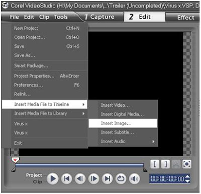
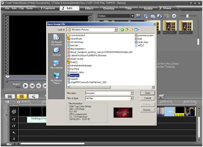
In keeping with my original plan, I added in the Lionsgate logo at the beginning; this was not difficult at all, it was just a case of finding the right image, which I got from the internet; then all I had to do was click File > Insert Media File into Timeline > Insert Image and then all I had to do was choose the image I wanted from My Pictures Libary. The image was automatically transferred to the timeline and I dragged it to the beginning of the trailer and added a blackout after it.


I will resume filming more of my trailer next weekend; all the filming and editing took 5 hours in total and I currently have 19 seconds of film.

Monday 10 January 2011

Making of my Magazine, 'FilmFest'

I have had prior experience working with PhotoShop to create a magazine. I gained this experience last year when I created a music magazine; 'PINK'. Therefore I had a fair idea of what to do when I started the production of this magazine front cover. I also did alot of research on magazine conventions (see post on Empire) so I already knew what I should include to make the magazine as realistic as possible.

My magazine is for young people aged 18 to 22, although I am certain that it would attract younger readers as well. It is for young people interested in new release films, film production (i.e. costume, makeup, set) and features interviews with A List actors.

I began with taking pictures for the front cover. I decided to use 'Tom' who is played by my brother to be on the front cover as he is the main protagonist and is not featured in the poster. I already have the element of blood and gore on my poster so I wanted to try something different. 'Tom' is seen on more than one occasion in the trailer, brandishing a weapon so I decided to use weapons as the main theme. My brother posed as if he were about to chop into the camera and he had a menacing expression on his face, however I encouraged him not to exaggerate this as it may make the picture look comical.

The picture was taken from a upwards shot; I had to physically kneel on the floor to get the angle right. I chose to do an upward shot because it would make the character of Tom look very dominant; this was befitting as he is the main character and throughout most of the film he has complete control over his sister, 'Jade'. The upwards shot also made Tom look very tall and large; this let the audience know that he was a threat (aside from the meat cleaver in his right hand) one of the 'bad' characters.

Getting the right shot for my magazine cover was not easy; I had to take the same picture many times and ask my brother to reposition himself. Lighting was also an issue; I didn't want any windows in my picture because I wanted the picture to have the feel of an enclosed space, that there is no escape. Below there is an analysis of the pictures I didn't use for my final cover as they had one or more faults.


This was the first photo I took when beginning work on the front cover, this was a 'practice' photo to see if this positioning is correct. From the start I wanted to do an upwards shot so I thought that using stairs would help greatly. However when I looked at this photo on the computer screen I was not happy with it. The photo does not allow the audience to see Tom's facial expressions clearly and he was holding the axe downwards so he did not look very menacing. I wanted to experiment with this photo as using software like PhotoShop can improve a photo drastically. I darkened the photo to try and make it look scarier and changed the saturation slightly to try and bring out the expressions on my brothers face, but this did not improve the photo; it made it even worse so I decided not to use this photo for my magazine cover. Obviously I would have removed the colourful blanket hanging over the banister if I were to use this photo.


This is the next photo I took for my magazine, I decided to opt for a low angle shot again, but my brother and I were on the same level in terms of flooring; he was not elevated in any way like the previous photo. However I still wasn't happy with the position of the photo, so I decided to crouch down even further to make the photo look even more imposing. The picture to the right was the result I had after I changed the angle and lighting;I also edited out the logo on my brothers t shirt using the clone stamp tool on photoshop. I decided that this was going to be my image for my magazine as it was very menacing; more of my brother's torso can be seen which accentuates his size and the lighting was perfect; the lights I used could be brightened and dimmed which helped me greatly in terms of lighting. I also left the door in the left hand corner of the picture ajar and switched on all the lights so it was as if 'Tom' was blocking out the light (goodness/hope) and only a little escaped. I feel that this gives the picture an eerie feel.


My final image (above, left) was taken with the flash on. As you an see this made the picture bright and my brother's features and body look shiny. I wanted this picture to be dark, so as to follow the conventions of a horror film, so I decided to edit it further on PhotoShop.
This process was very simple, I clicked on adjustments and altered the brightness of the image. I then changed the hue and saturation as well to acentuate the light shining out of the door and to emphasise my brother's expression as it was very dark.

Next, I began to add text to the image. I decided on a font quite quickly as i was not looking for anything extraordinary; I wanted a simple and effective font that was going to grab my audience's attention. I chose the font Trajan Pro as it is bold and simple. I decided that the font colour was going to be red as it stands out even if a picture is bright. My image is very dark; my brother is wearing dark clothes and the only colour that stands out is the light shining out of the door behind him. Red would probably be the standard colour for 'FilmFest' but I felt that red was also a good colour as it is relevant to my film; it is a horror and contains lots of violence and blood and red symbolises this very well. Below is the image with my desired font and colour; this was only a rough draft as I wanted to see what my magazine could potentially look like.


I was content with the font and colour but I felt that the text needed some effects addded to it to make it look more professional. I had also decided what features I was going to put on the magazine. The font size on the title is 200pt and it has the 'Bold' effect addded to it. Next I added some extra effects onto the font to make it look more professional and eye catching. The effects I used were:

Bevel and Emboss
Inner Shadow
Outer Glow
Outer Shadow

These effects made the text look far more professional and I was pleased with the results. Therefore I used these same effects on the rest of the text on my poster.
I also added in magazine conventions such as special offers, a bar code, a date line, the price and the issue number. The picture below is my finished product; I am very pleased with the results as I had very limited resources and I feel I have done the best I can. Please note that the quality of this image has depreciated by converting it into a JPEG, therefore all the features may not be as visible.

Thursday 16 December 2010

A2 Media - Conventions of a Movie Magazine (Empire)

I am exploring the various conventions for film magazines so I am able to produce a realistic, effective magazine cover for my film, 'Virus'. This analysis of Empire film magazine will enable me to understand my target market so I can make it ass attractive to potential consumers as possible.
Empire nearly always has the same style of front cover. There are large red letters saying “Empire” and there is nearly always just one actor, usually the main character of a new film being released on the front and the photo is usually posed or a snapshot/freeze frame from a film. The title on Empire magazine is usually in red but if there is a special edition or a certain type of film then this may change; for example, the issue of Empire that was featuring 'The Dark Knight' on the cover had a black title with a green glow. This was to match the film but could also attract the attention of regular cusomers if they see the magazine title has been changed. Empire is easily recognizable to its customers so they can pick it out from all of the other magazines in the shop. There are always main features and quotes around the edges of the picture to grab the customer, or potential customers attention, there is never writing in the centre of the picture as this would look messy and untidy. Like all magazines, Empire has the, date price, issue number and barcode on it. All these features on the front cover make it recognizable as a magazine. Empire is a very high quality magazine, glossy, thick paper is used for the back and front and the paper on the inside is thicker than most magazines so it is unlikely to tear. Therefore this magazine is more likely to last longer than most magazines which fall apart within about a week, thus the customer who bought this magazine can keep it for some time and perhaps refer back to it for whatever reason. By using these high quality materials, this makes the magazine more attractive which could prompt potential customers to pick it up and take a look.
About 50% of the magazine on the inside is advertisements for film and music stores such as HMV who are doing offers and deals, or advertisements for new films being released at the cinema or on DVD. Nearly every other page is an advertisement of some sort. Many magazines need lots of advertisements because they need the funding from whatever company is wishing to advertise because the magazine company does not have enough money to have all its own material inside. As soon as you open the magazine there is an advertisement rather than the index which is slightly unusual, however companies pay more for their advertisement to appear for in a magazine. I think the reason for this is that Empire is more expensive than most magazines and needs the extra funding.
Empire magazine starts with a countdown of “the top ten films of all time”. This is light reading; it is in small, snappy paragraphs which are quick to read under each film giving a brief outline of the film. By having this to begin the magazine, it engages the reader’s attention rather than having a really long interview with an actor or an actress which may cause the reader to become bored and discontinue reading the magazine. After this there is an index, in an easy, reasonably sized font.
The language of the magazine is formal; not as chatty as most celebrity/gossip magazines, which indicates that Empire is geared at a male, middle class target market and the age group is from about 25 to 40. The reason why I say “male” is because there are adverts for male skin products, one of which was an anti-wrinkle cream which indicates that Empire are reaching out to a slightly older age group. There is also an advert for FHM magazine, which is generally read by men, as FHM comes under the category, “lad mag”. Also, at the back of the magazine, there are advertisements for phone downloads such as wallpapers of female models; this feature would generally be used by men too.
Empire is an enthusiasts magazine; obviously for film and cinema. Apart from the advertisements, everything in the magazine is to do with film. It gives news about new films, where they’re going to be shown, they’re release and premier viewing dates and the general plot. There is always an interview with the actor who is on the front cover of the magazine, or there would be no point in making them the main feature. The interviews are generally over a double page spread with a large, posed photo of the actor or actress across it and sometimes snapshots of them in past or recent films they have starred in, there are also a few quotes from the interview blown up to a bigger font dotted around the edges of the photo or in-between paragraphs. The interview usually consists of questions about the actor or actress’s latest films, if there are any films they have been picked to star in future films and questions about acting life and how their coping. Unlike most celebrity/gossip magazines, there are very few questions about their personal life; again, everything is focused on film and everything to do with it. This is because the reader isn’t really interested in the personal life of the celebrity; they only want to know about the acting and film aspect. There are usually about three interviews with famous actors or actress’s, but they are not as long as the main feature, usually on a single page, but still with a large, posed photo and blown up quotes, the interviewer asks similar questions to that of the main actor but they are more specific and less detail is written about their answer.
Another thing I have noticed is that when there is a film advertized, there is also a picture of the main actor underneath with a quick, light profile of who they are, where they’re from and other famous films they have starred in. There is also a small leaflet advertising the next issue of the magazine and how to subscribe to Empire so that you will pay for it in advance and receive a copy every time a new issue comes out. There is all the necessary information on how to subscribe and there is also Empires website in case the reader wants to subscribe via the internet. This a good way to get customers to go on their website where there is news about film, there was a slogan saying “know it first” and another saying, “suggest to friends” which is a good way for exceptional enthusiasts and new customers to use the website.
Toward the end of the magazine there is a lighthearted quiz about film, testing the reader’s knowledge. As the magazine comes to an end, the reading becomes lighter and the last 6 pages or so are advertisements. Having advertisements at the end of a magazine can be a good marketing trick because people are more likely to remember what they read last rather than what they read first because it is fresh in they’re mind. The advertisements at the end are mostly mobile phone features, such as the downloadable wallpaper which I mentioned before and ringtones which are theme tunes of films that readers can subscribe to. There are also advertisements for film conventions and concerts which include contact numbers if customers want to book something straight away.
Empire defiantly meets up to the conventions of a film magazine. Almost everything is to do with film and the topics surrounding it such as actors, film awards and DVD’s. Empire gives their customers exactly what they want and they rarely stray off the subject whereas many other magazines do so. All the factors I have covered are the reasons why Empire is so successful within their target market.


The first picture above is of my magazine that I have created, 'FilmFest'. The photo is a posed shot of my brother. I considered using a freeze frame from the trailer but when I attempted this it became blurry and looked uprofessional. More information can be found on the making of my magazine on my other posts. The second picture is from Empire magazine promoting James Cameron's 'Avatar'. Obviously Empire is a major magazine and has access to far more sophisticated photography equipment than I do, so when one looks at the two magazines together, Empire looks far more professional, which is true. I created this magazine cover in PhotoShop and when I converted it into a JPEG the quality has depreciated. However my final magazine will not be in JPEG and is only in this particular format for the purpose of this post. Despite my limited resources I have followed all the conventions to make my magazine as realistic as possible. I have included other features such as the advertisment of another film and the promotion of a free James Bond poster. The main feature; 'Virus' is at the bottom and is in larger letters to grab the auidences attention. I have included a barcode, an issue number, the date, the price and I changed the saturation and lighting on the picture to make it appear darker. Before and after photos can be seen on other posts.
I feel I have followed the conventions of a film magazine to the best of my ability and resources. However this is not to say that I will not make modifications to this magazine in future. So far I am happy with the way my magazine looks but I am also considering doing a questionairre amoung my target market to find out what they think.

Monday 13 December 2010

Guidelines for Making a Magazine

I have done some research into magazine covers to help me create my own. I have found out what the different pieces of text on a magazine are called and where they should be. This information I have found will allow me to produce the best magazine I can.


I have also researched into what each of these labels mean and what purpose they serve:

Masthead (logo): This is the name of the magazine, it is always displayed in the same font or style e.g Cosmopolitan magazine always has the same font and the title is nearly always in red unless it is a special edition copy. Mastheads are always consistent so that they can be recognizable to the target audience and it makes a magazine unique from others. The masthead is usually used on the contents page inside as well as the front cover, and as a logo for advertising and branding.

Dateline: Month and year of publication, often with the price.

Main image: On this front cover there is a single image of the model Shania, but the main image can be more than one individual; providing they are in the same photo. This image is used in a classic way, the face is big enough to stand out on the news-stand, with the model making full eye-contact; this will attract the attention of new and existing customers.

Model credit: This is simply identifying whoever is on the front cover of a magazine. Most magazines usually display the photographer and model credit on the contents page but it is more common in fashion/women's magazines such as this one.

Coverlines: These are prominent features within the magazine, and usually appear larger than non- cover lines on the contents page as the magazine wants the customer to read these first. Coverlines are placed around the main image so the customer is not distracted too much and still pays attention to the main image. The colour of the font for the coverlines is very important too; a mistake that has been made here is the yellow writing on Shania's skin; it is unclear what the coverline actually says.

Main cover line: This is very large - taking up almost a quarter of the magazine cover. The main cover line is positioned against the model's shoulder and is in red so it shows up clearly.

Left third: The left third of the magazine cover is essential for sales in shops where the magazine cannot be seen fully; when magazines are stacked next to one another the left side is always sticking out from behind the other magazine. The title must be easily recognisable as it will be next to/behind many other magazines.

Bar code: Standard bar code used by retailers

Selling line: Short description of the title's main marketing point (for Cosmopolitan: 'The world's No 1 magazine for young women'). Most prominent magazines have them e.g. Empire: 'The world's biggest movie magazine'.

I will use this information to plan and create my magazine. It is essential that a lot of thought goes into compiling a magazine front cover so that it can promote what is on it and so it attracts customers and hence, increases sales.

Sunday 12 December 2010

Making Of My Poster, Virus

When I started work on my poster, after much research I decided that I wasn’t going to put any characters in my poster. I used PhotoShop to create this. My poster is very simple; it is a bloody hand print on a white surface with ‘Virus’ printed at the top, then at the bottom it has: ‘It’s Infectious’ and underneath that it says 27/10/2011 which is the release date. Even though my poster is simple it is also very striking as I have red and black on a white surface; this will draw the attention of potential audiences to take an interest in my film. I also think that by having no characters in my poster it mystifies my film and encourages the audience to find out more about it; most likely online.
The idea of using a bloody hand print was in my mind for some time and I finally decided this was what I was going to do as I have not come across a poster with this feature/image. However, I did not have the skills to create a bloody hand print using software on the computer, so I decided to do it in 'real life' using stage blood or paint.
To start off with I needed someone who was willing to have their hand painted to make my poster. My friend volunteered and we got to work straight away. Firstly, I needed to find a shade of red that looked like fresh blood; it is essential that promotional materials for films are as close to perfect as possible or there will be a negative view of the film before its even released and the target audience will not take it seriously. Below is a photo of the various shades of red that I sampled on paper to see which was the most appropriate. I did not use stage blood for my poster as it was not viscous enough; it bled right through the paper, therefore I eliminated stage blood for use in my poster.


To begin with, I got 4 sheets of canvas paper as it is very thick and I wanted the hand print to look as if it were on a wall rather than paper; to make it look more realistic and professional. At this point the hand prints were only 'testers' so I could determine what kind of hand print I wanted. below are photos of the various types of hand prints that my friend and I tested out. Originally, I wanted the hand print to be smeared as if the victim had been dragged away. However, as shown below in the first picture on the left, the hand print does not look like a hand print at all, just a red smudge. I could not posibly use such an image for my poster, so I asked my friend to drag her hand only slightly, in the hope that the hand print would be a smeared, but not so much that it was unrecognizable. This is the image on the right and it is obvious that it is a hand print, but it still looks distorted and unprofessional; therefore, I dismissed the idea of having a smared hand print and decided that I was going to have a 'normal' one.


I had now chosen what hand print I was going to use, so my friend imprinted her hand onto my first piece of canvas paper. However, as you can see on the left photo below, the image is striking but it is very plain too; there is too much white space around the edges. This image may catch my audience's eye but it doesn't look very realistic so it may not be taken seriously. Therefore, I decided to add blood spatters all over the white spaces around the hand print. I did this by dipping a paintbrush into the paint mixture that I had previously prepared before and 'flicking' it all over the paper. This created a spattered look as you can see in the right hand picture below, which fills the empty space making the poster more interesting, professional and realistic to look at.


I was pleased with the extra feature I added to my poster, but I was not happy with the lighting of the photo that I took above. The picture is too light and I wanted it to be dismal and dark, hereby following the conventions of a horror film. Therefore I changed the lighting slightly as I was working with dimmer switches; I closed the curtains and dimmed the lights. I also changed the positioning of the camera; I stood back further to see if the picture would be more effective from further away. As you can see the picture is slightly darker and there is some light surrounding the hand print as I used the flash on my camera on this occasion. However, I was still not completely content with the lighting; it was still not dark enough. So I turned the lights off completely and turned the flash up to the maximum brightness on my camera. The result is the right hand picture below. As you can see the light around the hand print is far more distinct and the spatters of red paint can still be seen around the edges. I was very pleased with this result and I decided this image was good enough to be my final poster.


Now that I had the perfect image for my poster, it was time to begin editing it in PhotoShop 8. My first decision was choosing the font I was going to use. This was a crucial decision as if the wrong decision is made then the font may make the poster look unprofessional which would spoil the whole appearance. This would be an incredible waste of my time if this were to happen as I had worked so hard to get the image as close to perfect as possible. Another problem that could arise from this is that my target audience may not take my poster very seriously; this could be a very big problem if my film were to be commercialised as a lot of money would have been wasted printing and distributing the posters only for them to be ignored.
Initially I wanted to use a font that appeared to be 'dripping' but as I had added 'blood spatters' to my poster I thought that this would be a bit too much; the spatters and dripping font may detract from the actual poster itself.
I decided to use the same font that I used on my magazine cover. Not only will this be recognisable to my target audience but it ticks all the boxes in terms of following horror film conventions; the font is clear and easy to read and it looks very 'stony'; one of my classmates pointed out that it looks like the writing on a gravestone. The font I used was Trajan Pro. Before I had actually made this poster I had wanted to have the font in red to symbolise blood; however this would have blended in with the red hand print and the image itself is obvious enough to the audience what the genre of my film is.

Font Editing -


I used two different effects on the title of my poster:
Bevel and Emboss -
- Style – outer bevel

- Technique – smooth

- Depth – 100%

- Direction – down

- Size – 32px

- Sharpen – 15px

Inner Shadow -
– Red, darken

- Opacity – 100%

- Angle – global light, -120°

- Distance – 16px

- Choke – 28%

As you can see in the picture above of my title, the effects are very exaggerated as opposed to other effects used in previous titles; my magazine. Achieving the final look of this title was a case of trial and error; I tested out different styles for each effect and decided which was best. Special font effects were still relatively new to me which is why I did so much experimentation. When I came across the 'distance' tab in the inner shadow section I found it to be very effective as it gave a very striking red shadow behind the black font as seen in the title above.


Tuesday 7 December 2010

Poster Preparation - Analysis of Horror Film Posters

I have researched different film posters to try and determine which type of poster I can create for my film. I did all of my research on the internet; I went to a website called allposters.com which had an extensive range of posters from all different types of films. However I needed the horror section and in it I found lots of different horror movie posters; some were old, others new. Below there are 5 different posters from horror movies that I think would be most suited to my film. I also chose these posters because they stood out the most to me when I was browsing through all the different images. Therefore I can take some of the ideas from all of these posters to formulate my own.

1. 28 days later


This poster really stood out as I thought that the eyes were very effective as they were the first thing I was drawn to. I think that ‘eyes’ would be a good idea for my poster as one of my main protagonists has a virus. (28 days has the same concept; an infectious virus is spreading all over the world causing people to become sub human). I also like the idea of the biohazard sign as the virus in my film is highly contagious, so it would be relevant if I were to include this. I have also thought about the idea of having a biochemist dressed in a biohazard kit holding a syringe; this could add to the mystery as the person would be unidentified and is not featured in the trailer. I think the idea of two different images that merge into one another is a good one because it tells the audience a little more about the film; from this poster I can see that there is a biohazard theme and a deserted city. The red saturation and the ‘cracked’ effect on the poster give the theme of blood, slaughter and decay which is relevant to this film and my own. The red is also very eye catching, so I will definitely consider using the red saturation for my own poster.

2. The Devil's Rejects


The Devil's Rejects is a very violent film with lots of slaughtering which is similar to my film; I also think that this type of theme; where no characters can be seen would work well for my poster as it mystifies the film.
I may add in a quote from a film magazine or website like this poster as it may encourage potential audiences to take more interest in the film or it may increase their expectations. The yellow saturation and the ‘cracked’ effect used on this poster give the theme of decay and death; so a red saturation may not be necessary on my poster to convey this. The use of a caption at the bottom ‘They must be stopped’ tells the audience more about the film and makes the poster more sinister. This would be ideal for my poster as it is relevant to my film.
The arm lying in the doorway is very graphic, but it lets the audience know that the film is about death and murder. The graphic nature of this poster may also encourage horror fans to watch the film.

3. The Texas Chainsaw Massacre


I like this poster because of the extreme close up shot of ‘Leatherface’ from the Texas Chainsaw Massacre. The fact that his face is partially shadowed makes it more scary and sinister. I think this type of picture would be ideal for my poster; it could be a partial extreme close up of ‘Tom’ with blood smeared around his mouth or just a side profile of his forehead and red eye with the rest of his face in shadow. The textured, grained finish on this poster is very effective because it makes Leatherface look even more scary and hideous; I will consider using some sort off effect on my poster when I begin.
The title of the film at the bottom of the page is better as opposed to the top because then the audience are automatically drawn to the image first, which is my main aim in making this poster.

4. Halloween II


The picture on this poster is very effective because it looks like a snapshot from the film but it is definitely a posed photo that is violent and graphic. I could have the same type of shot for my own poster with Tom wielding an axe or something similar, however this may be difficult to do and may require a lot of editing to prevent it from looking comical.
I like the caption at the top because it could encourage the audience to see the film, yet it is still mystifying as it is only one line; for example on my poster I could put ‘It’s spreading’.
I also like the contrasting colours between the background and the title as it can be seen in ones peripheral vision and may attract potential viewer’s attention because of this. I may also add a release date onto my poster to make it look more professional.

5. The Crazies


This poster caught my attention because of the large sign and the fact that there are no characters in it. I could do something similar for my poster like a bloody handprint smeared on a window; this would be ideal as the ‘handprint shot’ features in my teaser trailer. Also by having no characters in the poster it mystifies the film and sends out a message ‘Help Us’. This message also looks like it has been drawn in blood which indicates violence.
The title on this poster is slightly unconventional as it is small and in the bottom right hand corner. However the word ‘Crazies’ is most noticeable and the title is in red which is a good contrast to the landscape background and will draw the audience’s attention to it.

Analysing these posters has given me an insight into the conventions of a horror movie poster. Costume, mise en scene, camera position and lighting will all be key in making a successful poster that will attract my target audience. I now have a better idea of what my poster is going to look like.

Tuesday 30 November 2010

Media Film Trailer Outline

After much research of both professional and amateur student teaser trailers I have now formulated a precise script and film plan.
My film which I will be making a short teaser trailer for is called Virus. The main protagonists will be a brother and sister; Jade and Tom. Tom has just returned from travelling around the world on his gap year and has come to stay with Jade for a few weeks. However he begins to act strangely and appears to be coming down with a fever, but things take a nasty turn when Tom has continuous outbursts of aggression, paranoia and threatening behaviour. Tom’s physical appearance also starts to change; his skin becomes pale and his eyes become red; he is not sleeping and his hair is falling out. Jade tries to get him to go to the hospital but he refuses and holds her captive in the house. She tries numerous attempts to get help and escape but Tom cuts the phone lines and barricades the door, preventing her from leaving. It is now obvious to Jade that her brother has picked up some sort of virus from his travels around the world that is making him go mad. Tom forces Jade to participate in a murder and almost kills her in the process as she tries to make another escape from him. Jade’s absence sparks suspicion in the local neighbourhood and a woman across the street calls round to check that everything is okay and Tom ends up holding her captive too. Things become even more sinister when Jade notices that the neighbour is displaying the same traits as her brother; she is also infected with the virus. By this point in the film the police are involved. They break into the house and shortly after Jade shoots Tom. The film ends with Jade in a police interview room and she notices that the detective interviewing her has red eyes and is shaking; he has also caught the virus.
Trailer Plan –
Here is a plan of what I want my trailer to be like, this is the first one I have done so far so I know it is more than likely that some parts will change, some will be cut and new pieces of film may be added in. I have stated how many seconds I think each of my desired clips will take as I do not want this trailer to be too long as it is only a teaser trailer.

The trailer's event's will take place as follows:

1.( Soundtrack on) (Lionsgate Logo) Jade and Tom hug and Jade says: “You’re back” and smiles. Title: ‘Nothing is more important than family’ (2 seconds)

2. Tom is looking unwell with reddening eyes and Jade says “I think you might have caught something” Title: “But sometimes...things change” (3 seconds)

3. Tom smashes a plate down on the floor and shouts: “Leave me alone!” (Pointing finger)(3 seconds).

4. Jade hammering on the door screaming: “Help! Somebody!” (2 seconds)

5. Jade to Tom: “You need help Tom, you’re sick!” Tom is standing in the doorway of a basement with Jade at the bottom of the stairs (3 seconds)

6. Flashing images of Tom with blood round his mouth and Tom lunging with a knife. (4 seconds)

7. Shot of Tom dragging a knife against a wall whistling and saying: “Oh Jade, come out come out wherever you are” (4 seconds)

8. (Soundtrack off) There is darkness. Jade is on a mobile and has a lighter flicked on: “999 emergency” (Jade) “There’s something wrong with my brother” Jade goes up to the window and suddenly Tom slams himself against it, Jade screams and the light goes out. (6 seconds)

9. Title: “Virus” (Smouldering sound effects). Title: “Coming this fall”. End. (3 Seconds)

It is very important for me to remember that this plan of my trailer is likely to change. This is because sometimes ideas can appear to be good on paper but when they are actually put into practice they do not work. However, I will stick to this plan when I start filming so that I have a sense of direction and post an edited version if necessary.
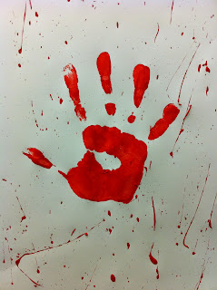
Below are two photos of my story board that I prepared in class. By drawing a story board it gave me a basic idea of what my trailer may look like when I actually come to film it.